Sunday, January 25, 2009

Future

Sometimes we get caught in stuff, at least that's what we say. When we think this way suddenly things fall between the little spaces between our fingers and we find great excuses how that happen. Well, no matter how much I excuse for not following up with new posts - its not good enough.

Have you seen the new Pepsi logos and packaging designs? I tried to find some opinions on the net about the new look, and most of what people say seems to be negative criticism. I somewhat disagree. The first time I saw the new marks was on the latest TV commercial Pepsi Pass - 60 second; a great collage of the awesome old school adverts the company has had into one sequence, showing the progress and evolution of the brand, ending with the view of the new design. I find this design truly refreshing! The lower case highly geometric and modern pepsi letters are pleasing to the eye and showing a sense of advancement, of trying something new and moving forward to a new young direction. True, as mentioned in some blogs the type can be seen as somewhat art deco, or avant garde - but isn't that what's awesome about it? The logo mark is customized for every product which is also a strong expectation element of design nowadays.
The one thing I do not enjoy is the bottle design which simply does not correspond to the clean modern look of the labeling. I believe the new design deserves some credit, it carries a spark of change and progression, yet I agree one can expect a little more out of such a corporation.


On the note of new design, I lately found through a friend about 2Advanced Studios, a design and media company thriving behind the notion of "Progressive Design Technology". Quoting: At 2Advances Studios, we harness our insight, dedication and expertise to challenge the boundaries of creativity and deliver tomorrows capabilities. You can say that again! Apart from an extremely impressive web and flash skills and overflowing creativity I find that the company has truly captured the essence of futuristic design, both functional and aesthetic. Pay it a visit, check out their impressive portfolio and get immersed in the world they have created.

Tuesday, January 13, 2009

Europe by David Cerny - Controvercy?

It feels great when the word "art" comes up in the BBC headline news. I guess they find it valuable only when it has the potential of controversy. This is the title to the article at hand published today on the BBC website: Czech EU art stokes controversy. It showcases Europe by the Czech artist David Cerny. The Czech are to be the new presidency of the EU. The new presidency was sure they commissioned 27 artists from all EU countries to create an art piece that would hang at the European Council building in Brussels. Instead, this is what they got. Being a European and have travelled to many of the EU countries I find this case of art a very interesting one. David writes on his site "Self-reflection, critical thinking and the capacity to perceive oneself as well as the outside world with a sense of imny are the hallmarks of European thinking" - Really?
The so called 'truth' is many times not an easy one to face, yet it is important to consider no matter how subjective/objective it may be. Having the ability to laugh at yourself, and take in criticism is also a milestone in the process of advancement. On the other hand, everything should be done in an appropriate time and place, with respect to the individual and whole. Yet, isn't imbalance the main ingredient of balance?

Bulgaria, my birth country, is portrayed as a toilet, and definitely not a modern one. The first moment I saw the image it raised funny ridiculous memories of the many times I had to use one of those - later I realized how sad that reality actually was and still is, and how much more it says about the country. As controversial as this project may or may not be, I believe it deserves great attention for it holds some strong messages that we should all consider.

Sunday, January 11, 2009

Getting the Message Across

As I was browsing a few of my bookmarks lately to see what was new I noticed a trend among the web design of a few successful companies and firms: Simplicity!
Now, I know this isn’t a new controversial concept, yet it keeps proving its functionality and efficiency over and over again. A simple, clean and open design seems to give room and space for great typography, compositions and messages to do their job in excellence: communicate. Have a look at the web pages of
Free Agency Creative, Paprika, Orange Tango, Rethink Communications and even Apple – they all sustain a minimalistic, simple and beautiful way of getting the message across, going against the massive stream of cluttered complex web pages. As a designer, I must admit that creating such “clean” design is just as difficult as designing a complex “full” composition – the “simplicity” look isn’t a very simple one to achieve, for many reasons. This might not be the only way to getting a point across, but is certainly one that is working and carrying a respectful image of quality and professionalism.


Busse-like Inspiration

Not long ago two classmates of mine and I were fortunate to conduct an interview with Mark Busse; the President (07/08) of the BC Chapter of the Society of Graphic Designers of Canada, and the Design Director of Industrial Brand, a design firm specializing in brand strategy, corporate identity, communication design, and interactive design and development. The experience and conversation was deeply inspiring and enlightening, not only for the quality of advice and insight but also for Marks enigmatic and magnetic character. In addition to a tour in the studio of IB, he kindly gave me and my partners an insight to the genius and creative mind of a successful individual /role model. This is an additional acknowledgment of this great opportunity to be directed and inspired by a professional such as Mark. Check out the new and renovated Industrial Brand website and see for yourself some their great design and work. Mark, thank you :)

Wednesday, January 7, 2009

Pour Pritt by Build

Pritt is a the company that was first to come up with the glue stick in 1969. Since then they had grown to specialize in many other adhesive stuff, and among then their new MyStyle correction rollers : B-Fun, D-Lux and I-Tool Build, a British Graphic Design studio did the advertising campaign for this new exciting product. Build was "established in 2001 by Michael C. Place, and has since forged an international reputation as a forward-thinking Graphic Design studio with an exceptional eye for detail and a unique sense of style". Here is a YouTube link to the full version of the ad. I find it absolutely beautiful and elegant, yet packed with energy, style and playfulness.

http://www.youtube.com/watch?v=f3TTZJBmZWQ

Also, meet with the three cute rollers in their own
environment; the animated and characterized rollers in the animations make you want to 'adopt' one and try out a doodle or two :)


Tuesday, January 6, 2009

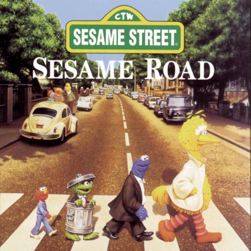
Luminus Studio and Sesame Street

As I have taken already a few 3D animation courses and have a great fascination with XSI Softimage - you can say it is a minor to my degree in Communication Design. In a little while I will post a few of the modeling and animation I have already done. Meanwhile, checkout Luminus. "Luminus is a one stop creative studio, based in Los Angeles and Zagreb (Croatia), specializing in concept development, design, production and post production of motion media. Over the years they have created and produced numerous TV commercials, show and convention opens, animated logos, motion graphics packages and 3D animations."

Isn't it facinating when reality meets imagination and becomes visual? This strategy of grabing attention is known for a while. In
The Tipping Point, Malcolm Gladwell tells the story of Sesame Street, and the way a key to the attention of kids and their learning was to fuse the fantacy scenes with the realistic ones. Accordding to the study, before those two were fused, kids were watching more tentively in the fantacy scenes then the realistic (where adults and children were talking and playing). The moment those two different worlds were fused, the viewers attention rose significantly, and so did their learning outcomes.

Monday, January 5, 2009

Lessons from Improv by Behance


One of my favorite design networks on the web is Behance. The unlimited inspiration and exposure one can get from just viewing the work of other artists and designers is incredible. Apart from visual delicacy, Behance has some great articles and by designers and professionals, overviews on exhibits and events, and tips for success by the pros. I recently read this short article, Lessons from Improv, on the Behance Magazine - it reminded me how great it is when one can learn something out of everything. The strategy suggested, taken out of Improv, has worked for me many times... and is one of the most fun ones. Check it out :)

Farmboy Fine Arts

FBFA, based in Vancouver, is a company which specializes in developing site-specific artwork and design objects for hospitality, healthcare, retail, casinos and corporate environments. I worked for them as a Design Intern this last summer. The experience was very rewarding! The people and the work of FBFA are absolutely awesome and I love those dearly. Check FBFA online and see for yourself. The photography and artwork they are offering is very beautiful and inspiring. Indeed stepping into making design a way of life.

Sunday, January 4, 2009

DoCommentary

This is the first of two semester long projects in my last graduating year at Emily Carr. It is a participatory design project for an interior that challenges graphic design’s page paradigm.
With this project I argued that within the practice of Communication Design the role of the designer and client are often clearly defines and separated from each other - Taking away from the positive potential outcomes of collaboration. I intended to show that by making the client a partner of the designer a more accurate and meaningful realization of the clients wishes can be achieved. Through the Process of participatory design I introduced a way in which graphic design can enrich the relationship and connection between an individual and their surrounding space.
My client was Eitan Pinsky, and the space we worked on was his bedroom. I built a series of participatory activities that assisted me in understanding Eitan and his wishes; and assisted him in understanding what he wanted, and how he wanted it. Together, we built a trustworthy relationship with a goal to transform the room into a spacious bedroom and a reading space – all with the assistance of graphic design. The complexity of this project simply can not be translated onto this blog since it was a multilayered experience with so many components and stages. What I can show you is the before and after shots which I believe say a lot.
I learned much from this experience and I gained tremendous satisfaction to know I have made a persons life a little richer and more pleasant.

Saturday, January 3, 2009

Disabstraction - Big Bang Theory for All

This project was done in the frame of a typography course I took in 2008 ; fun fun fun :-).
The goal:
To provide a new method of presenting a great deal of extensive scientific information regarding the Big Bang Theory, available by means of a simple search in Wikipedia.
The concept: To simplify the complexity of the text to suit a reader who is not necessarily familiar with scientific terminology, but is nevertheless eager to learn.
The approach: To simplify the vagueness and complexity of scientific text by the usage of unconventional imagery. This concept adds beauty and elegance to the topic, as short definitions are gently extracted from the complex scientific content.

The interaction between text and images is the fundamental concept in this booklet, created in order to maximize imagination of the written work. All the visuals in the booklet are created by using a technique of combining drawing with light and photography. The images are carefully rehearsed to suit the subject matter and later converted to gray scale images and then inverted. Tadaa ....


The Green Living Show

At the end of February 08 Vancouver's Green Living Show took place. It was entirely dedicated to all things green and environmentally friendly. From fair-trade coffee to new innovative vehicles, from small shops to giant corporations, it had it all. My class, with the guidance of our instructor Clement Vincent, were lucky to have our own little voice in the show.

The goal was education - as knowledge is the key to change. Plan B 3.0 by Lester R. Brown was the inspiration and voice of our intentions. Therefore, what would have been better then quoting the master. The main portion of our exhibit consisted of extracted passages from the book about a few significant topics, such as water, food and waste. Each quote was put on a jar containing the substance of the topic. Those were arranged on a grid, over coasters saying "we don't inherit the world from our ancestors, we borrow it from our children". We put a few benches around and encouraged visitors to pick up a jar of their liking and engage with the quote. We usually sparked a conversation and explained even further the context of the words. Would you believe how many people stopped by? Parents, couples, scientists, teachers, artists, travelers, doctors and countless little children, stopped by and fed their curiosity with the sparkling glass jars, filled with unexpected stuff. "So, you are not selling anything?!" No, we were only there to offer
you some jars for thought. Check out this short article
"The Grass is not Always Greener" about the exhibit.

We underestimate the potential of this ancient instinct - curiosity.


Friday, January 2, 2009

Malcolm Gladwell: What we can learn from spaghetti sauce

TED is one of my favorite sources of inspiration.
What could be more delicious then new ideas, creativity and innovation ?! Spaghetti Sauce!
http://www.ted.com/index.php/talks/malcolm_gladwell_on_spaghetti_sauce.html

Getting Started

"The secret of getting ahead is getting started. The secret of getting started is breaking your complex overwhelming tasks into small manageable tasks, and then starting on the first one" ~ Mark Twain

Welcome!


I am so glad and thrilled you are reading this first fresh post of my blog DESIGN witha D ! My name is Daniela, nice to meet you. I am four months away of becoming a proud Communication Design graduate at the Emily Carr University of Art and Design. How excited I am. The past four years of my degree have changed me tremendously, opened my eyes, heart and mind to the worlds beautiful and sometimes strange ways. I am thrilled as I know this is just the beginning of a wonderful journey towards the pursuit of my personal legend, of my dreams. Therefore, I have decided to open my book of thoughts and experiences to all, with the goal to inspire and be inspired. In this context of DESIGN witha D I would like to welcome you to be a part of my voyage. So, without further due, let's cut to the real thing. Cheers